rapid design responses to one-week-length microbriefs
methods: design sprints, python coding, Adobe Premiere Pro, Adobe After effects, product + time management
tags: food waste, social anxieties, algorithm errors, visual puns, accessories, consumerism
outputs: designed responses + presentations for six different briefs
As part of my first term at the Royal College of Art, I created six responses to microbriefs in one week sprints. The briefs were assigned on a Monday and due the following Monday, and were kept vague enough that exploration was encouraged. For each week, I wanted to challenge myself to learn or refine a skill I hadn't before, for example, stop motion animation, After Effects, or wax experimentation.
These projects show my flexibility and creativity in responding to time pressure and also my ability to learn and adapt quickly on new skills and programs. I was able to crystallize on a five-day capsule for responding to a challenge with what I call an 80% polished product. That final 20% of completion might take further iterations perfect, but in a workweek, I can get 80% of the way there.
My design process was as follows:
Monday: brief assigned, ruminate on the brief
Tuesday: finalize on a concept after drawing inspiration
Wednesday + Thursday: work on the brief
Friday: work on the presentation
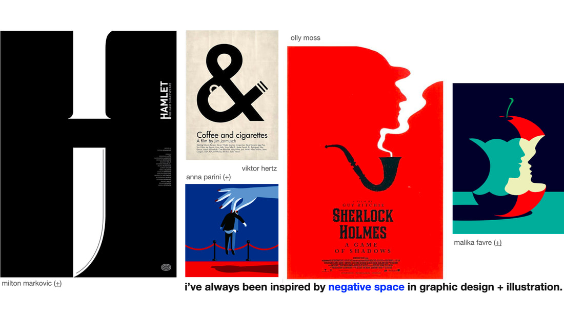
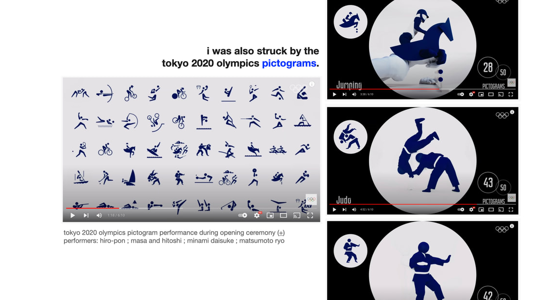
I've always been inspired by negative space in graphic design + illustration. I was also struck by the simplicity of the 2020 Tokyo Olympics pictograms.
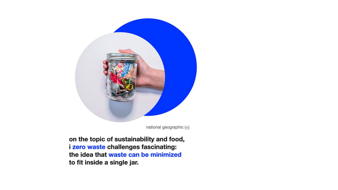
On the topic of sustainability and food, I find zero waste challenges fascinating: the idea that waste can be minimized to fit inside a single jar.
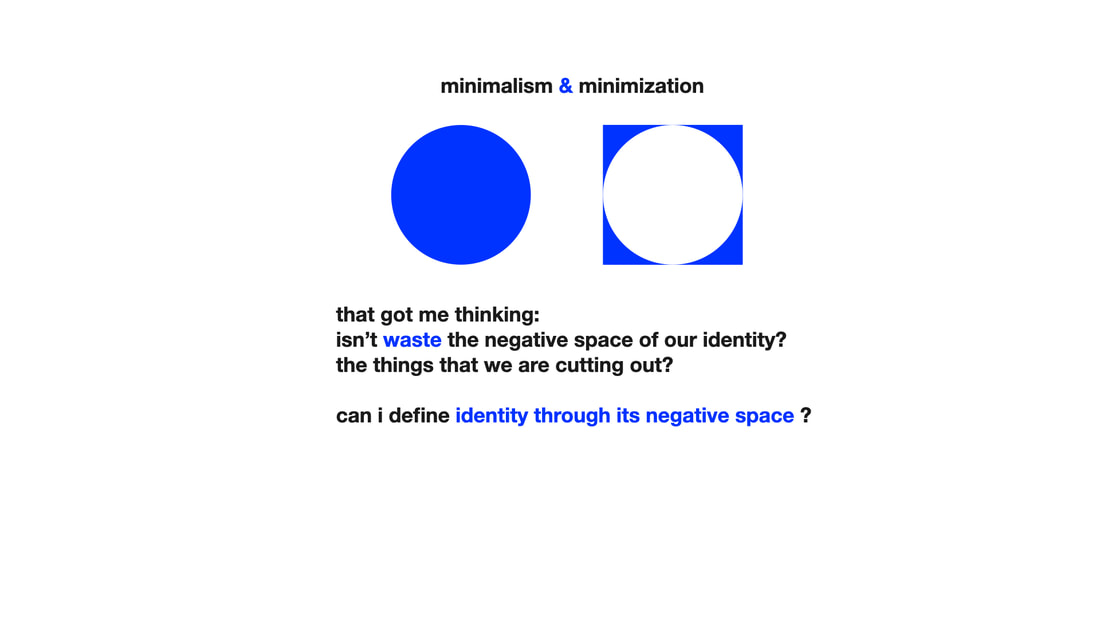
That got me thinking: isn't waste the negative space of our identity? The things we are cutting out? Can I define identity through its negative space?
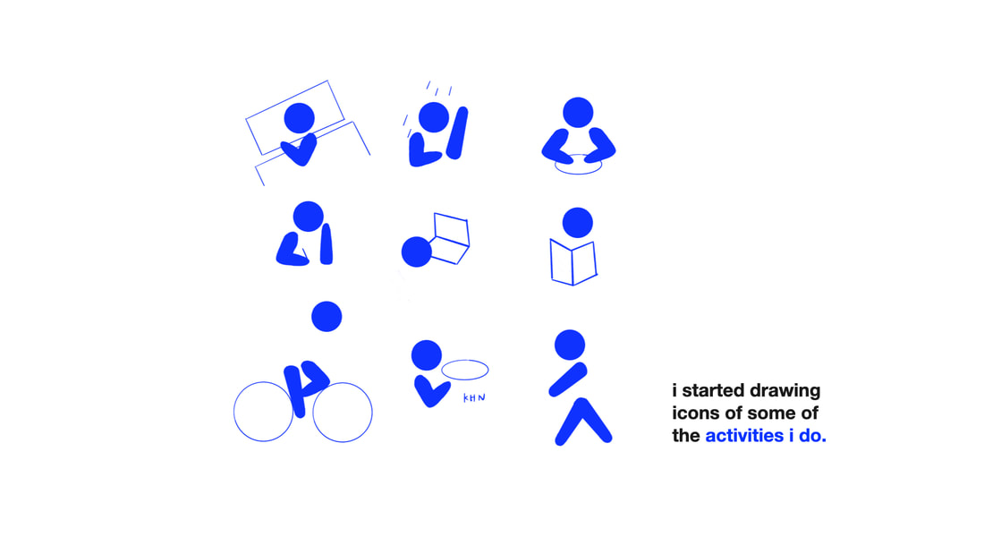
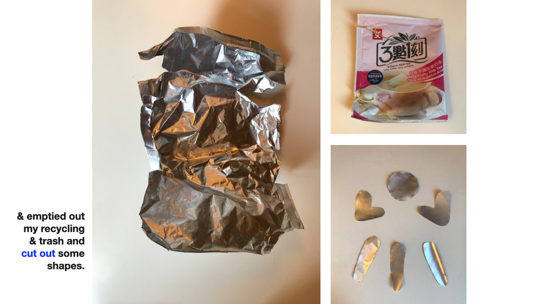
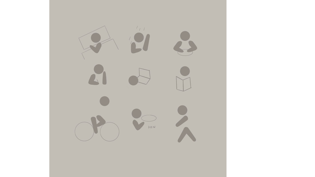
I started drawing icons of some of the activities that I do. And emptying out my trash and recycling bin and cut out some shapes.
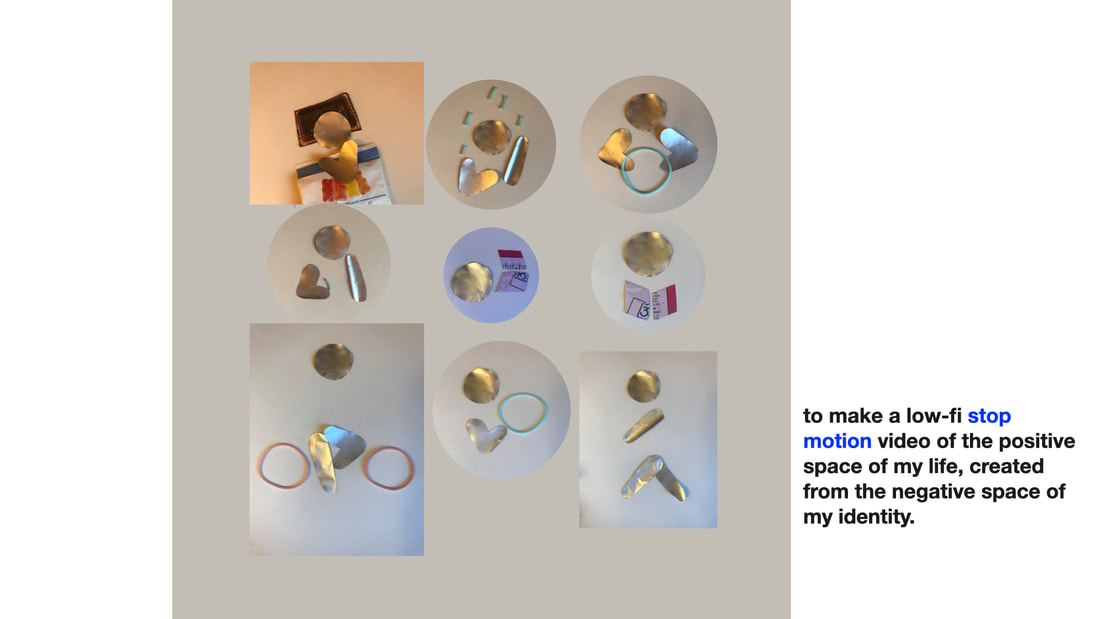
I made a low-fi stop-motion video of the positive space of my life, created from the negative space of my identity.
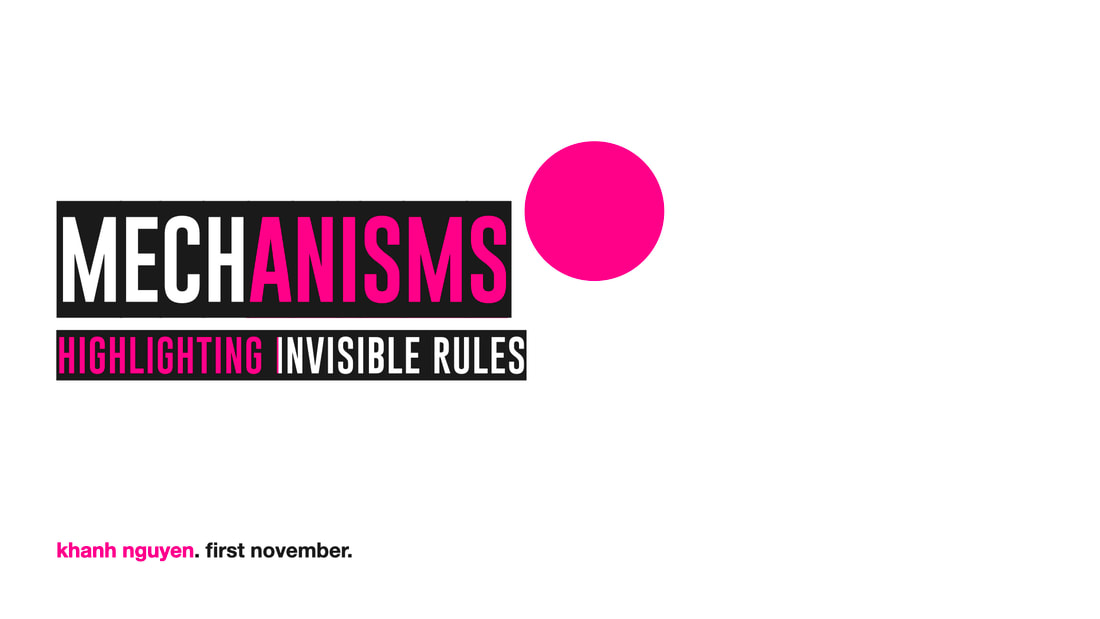
As a former mechanical engineer, I took the prompt mechanisms and decided I wanted to explore social mechanisms: things less physical.
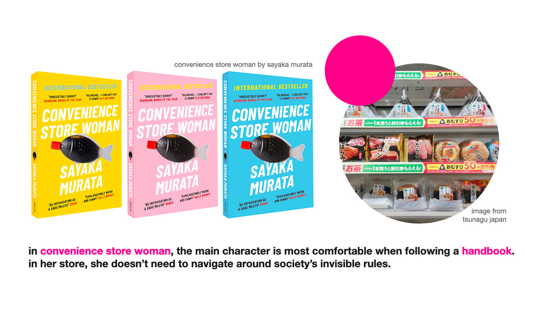
In Sayaka Murata's Convenience Store Woman, the main character is most comfortable when following a handbook. In her store, she doesn't need to navigate around society's invisible rules.
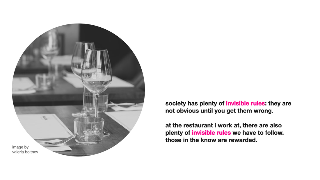
Society is full of invisible rules: they are not obvious until you get them wrong. At the restaurant I worked at, there were invisible rules to follow. Those in the know got rewarded.
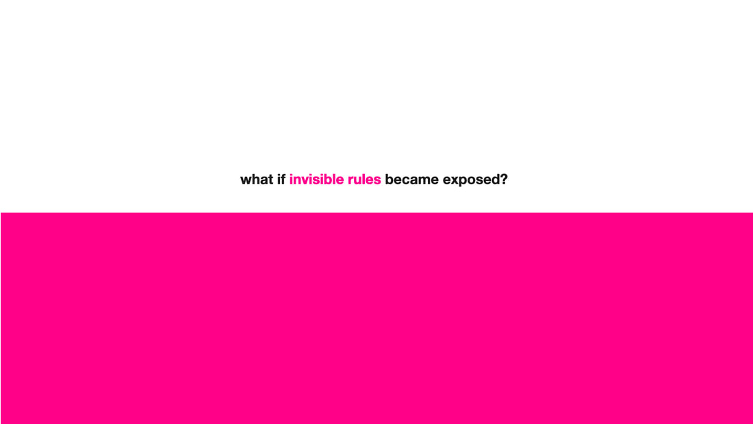
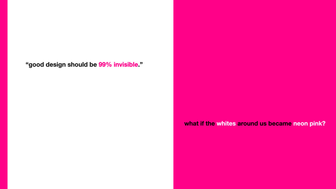
I thought about the quote 'good design should be 99% invisible.' Well, what if the invisibles and whites around us became neon pink? What if invisible rules became exposed?
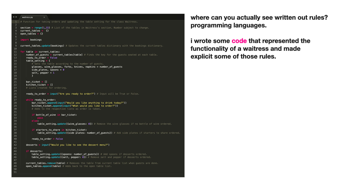
Where can you actually see written out rules? Programming languages. I wrote some pseudo-code that represented the functionality of a waitress and made explicit some of those rules.
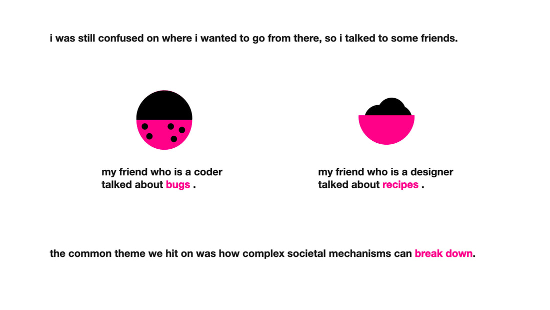
I was still confused about where to go next, so I talked to some friends. My friend who is a coder talked about bugs. My friend who is a designer talked about recipes. The common theme we hit on was how complex social mechanisms can break down.
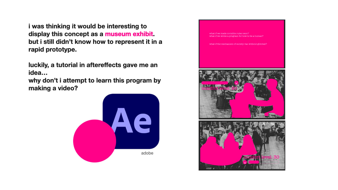
I thought it would be interesting to display this concept as a museum exhibit, but I didn't know how to represent it in a rapid prototype. A tutorial in After Effects gave me an idea... why don't I attempt to learn this program by making a video? I could create special effects to represent my idea. Thus: waitress.py was born.
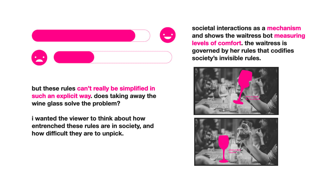
The waitress bot measures levels of comfort and reacts according to her rules, that attempt to codify society's invisible rules. But these rules couldn't be easily simplified. Does taking away the wine glass solve the problem of happiness? I wanted the viewer to think about how entrenched these rules are in society, how difficult to unpick.
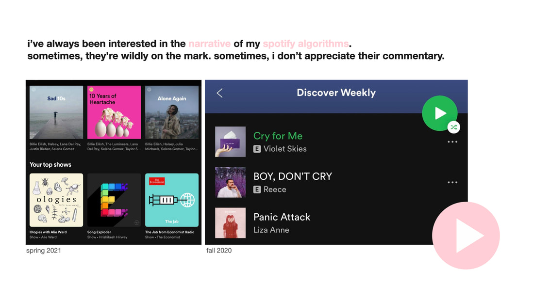
I've always been interested in the narrative of my Spotify algorithms. Sometimes, they're wildly on the mark. Sometimes, I don't appreciate their commentary.
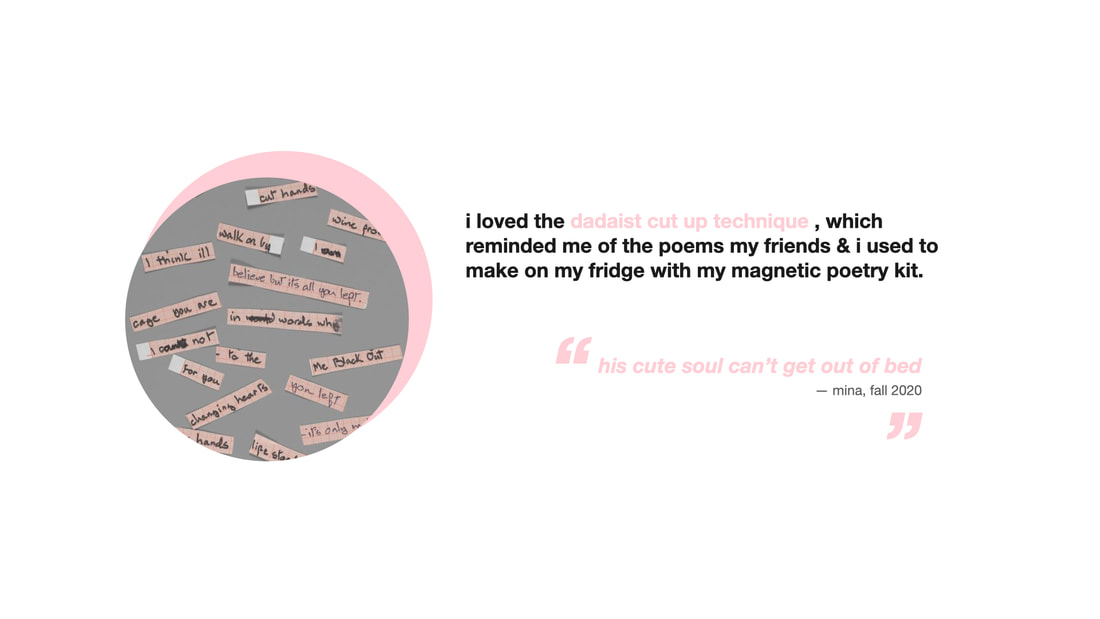
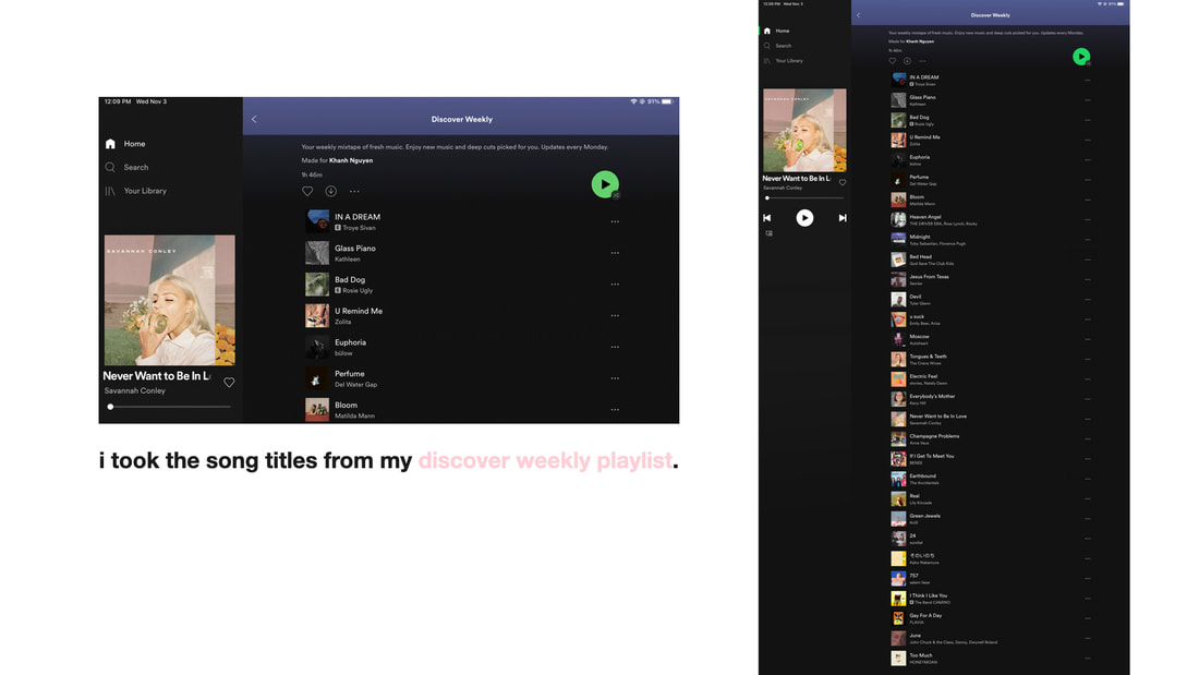
I loved the Dadaist cut up and scramble technique, which reminded me of the poems my friends and i used to make on my fridge using my magnetic poetry kit. I took the songs from my discover weekly playlist.
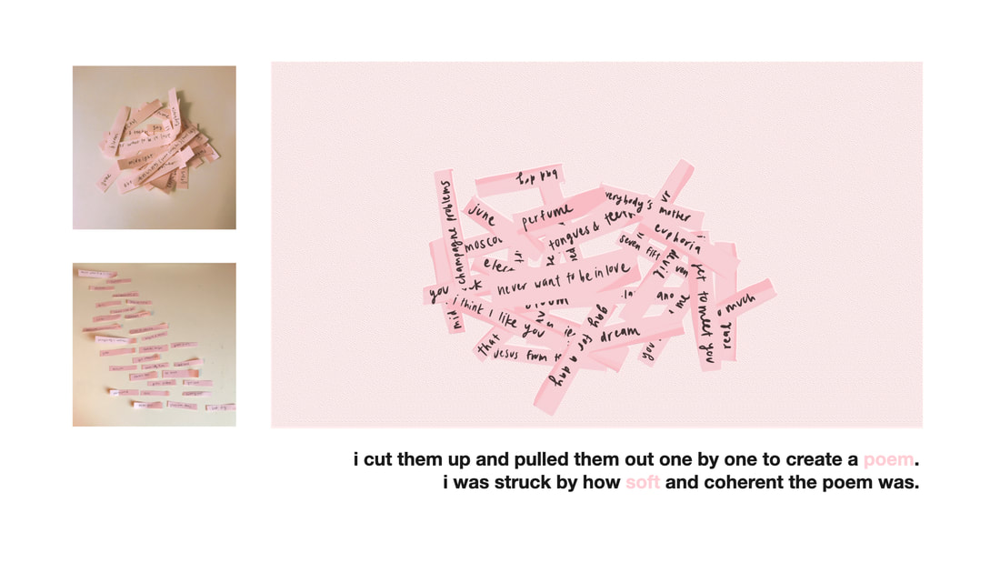
I cut them up and pulled them out one by one to create a poem. I was struck by how soft and coherent the poem was.
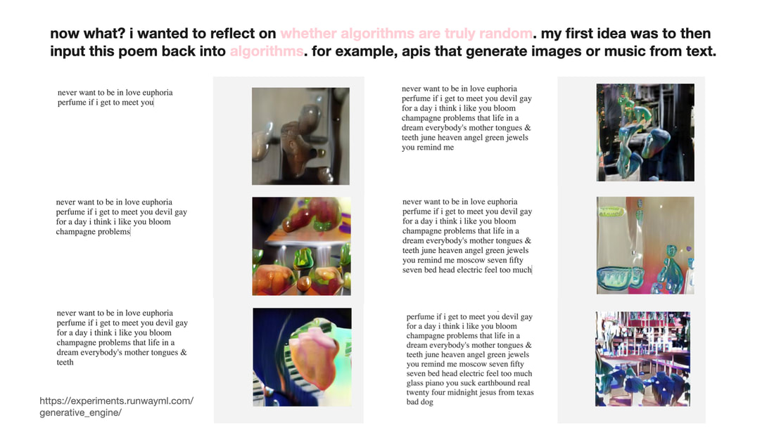
To reflect on whether algorithms are truly random, my first idea was to input this poem back into an algorithm: in this case, apis that generate images or music from text. I used "generative AI" before it became popular.
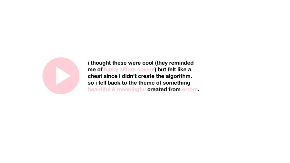
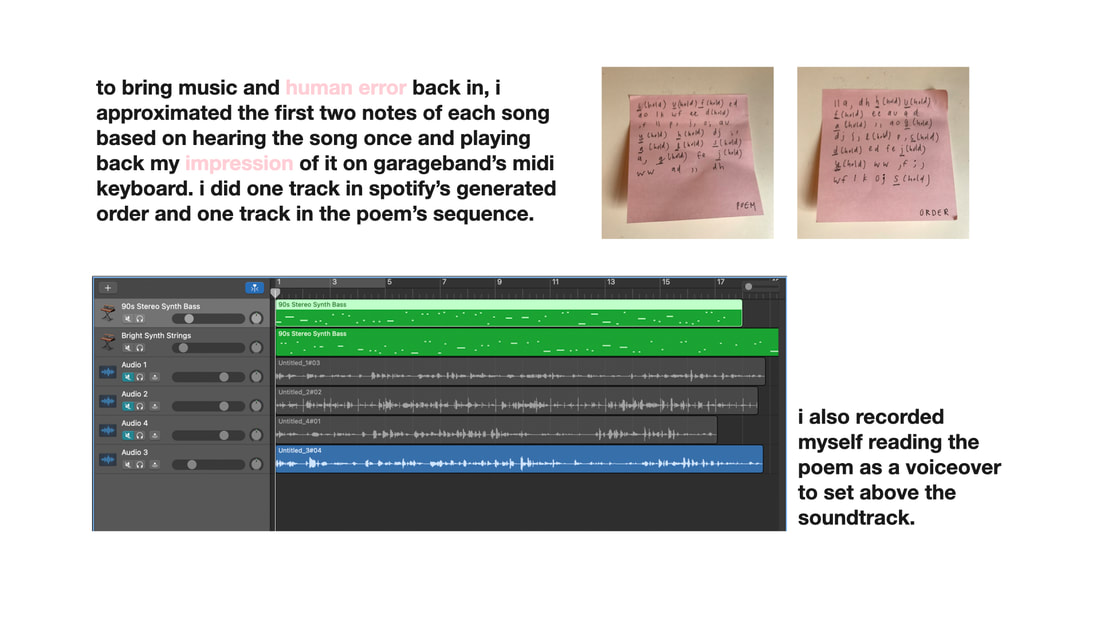
These were cool, but didn't feel right because I didn't create the algorithm. So I fell back to the theme of creating something beautiful and meaningful from errors. To bring music and human error back in, I approximated the first two notes of each song based on hearing the song once and playing back my impression of it on GarageBand's midi keyboard. I did one track in Spotify's generated order and one track in the poem's sequence. I then recorded myself reading the poem was a voiceover to the soundtrack.
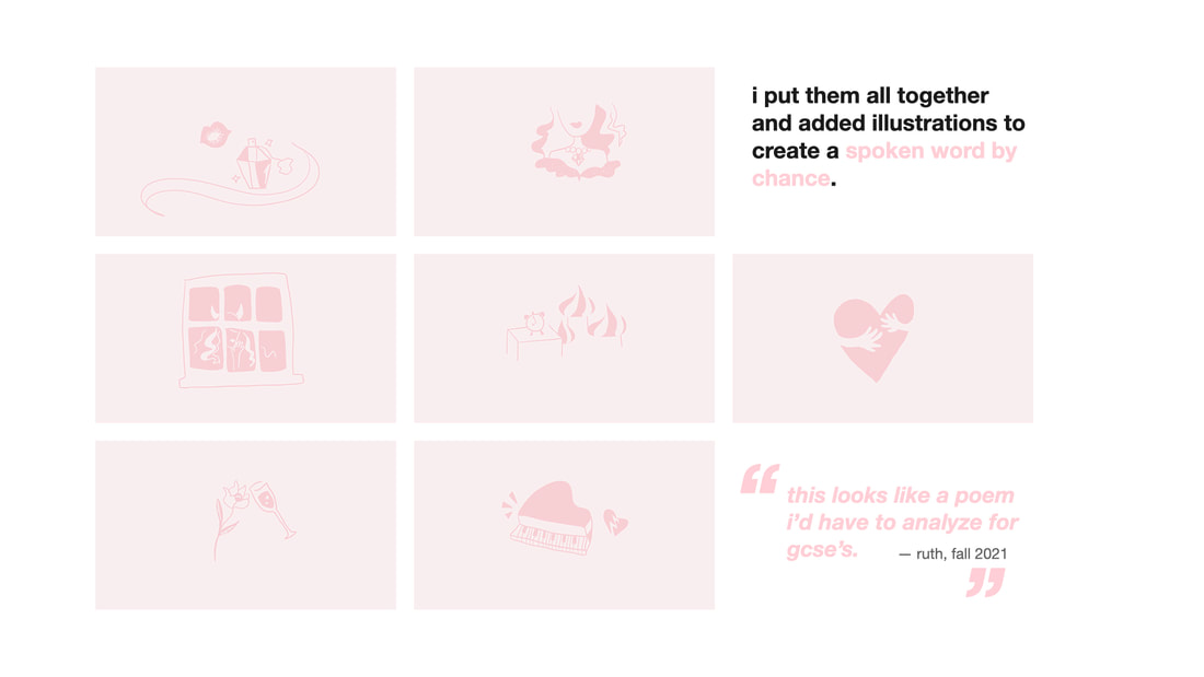
I put them all together and added illustrations to create a spoken word by chance.
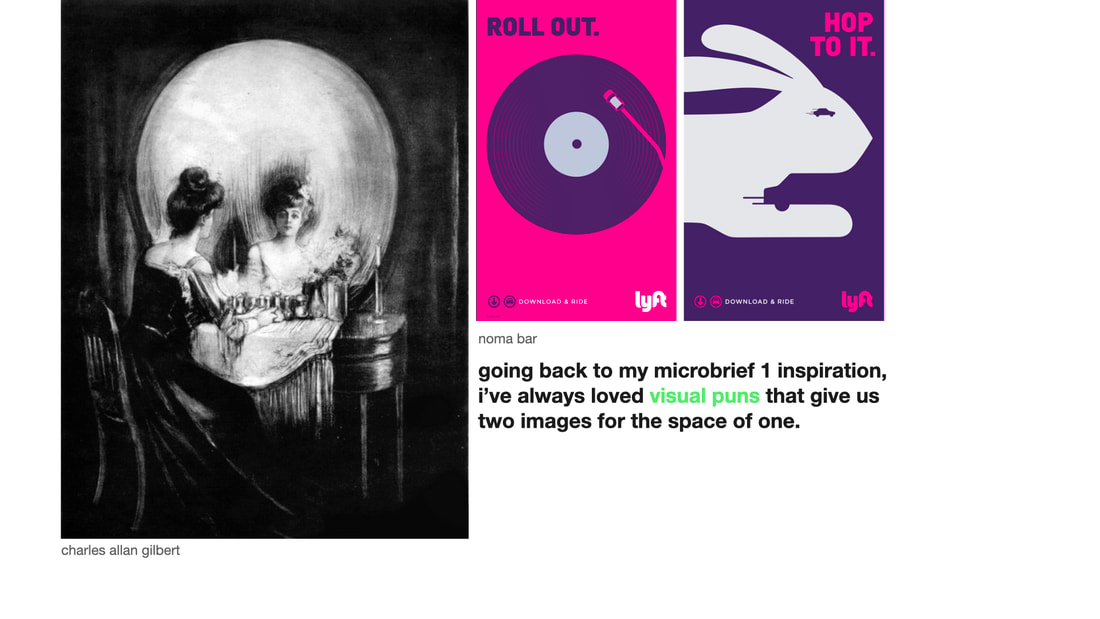
Going back to my microbrief 1 inspiration, I've always loved visual puns that give us two images for the space of one.
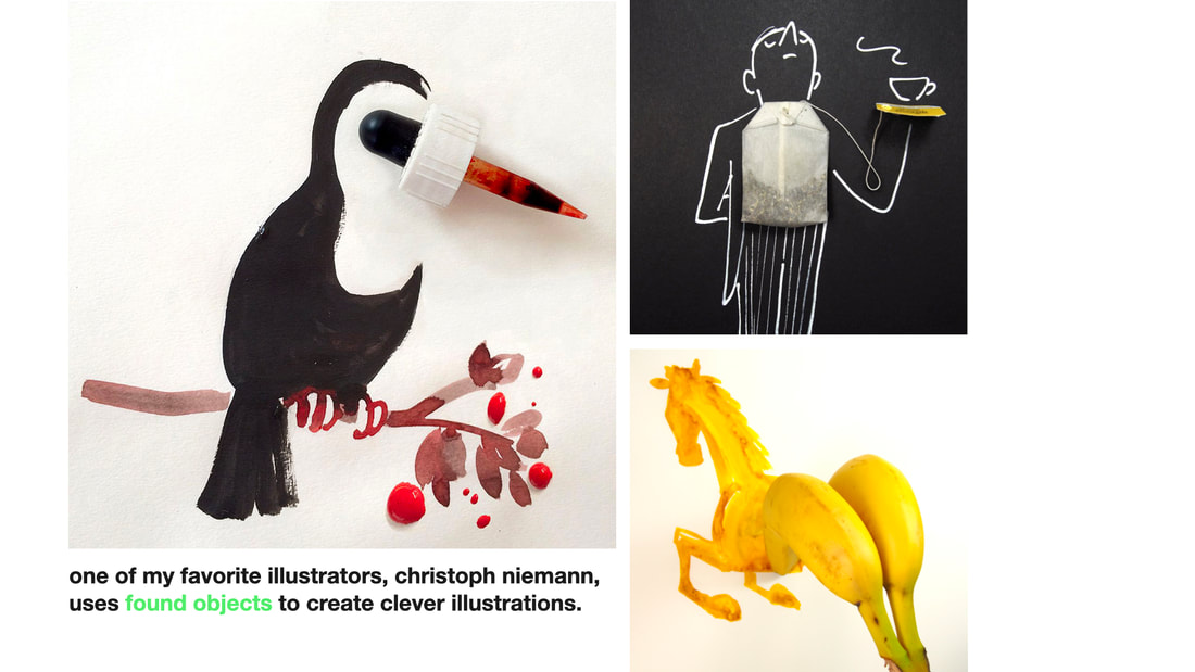
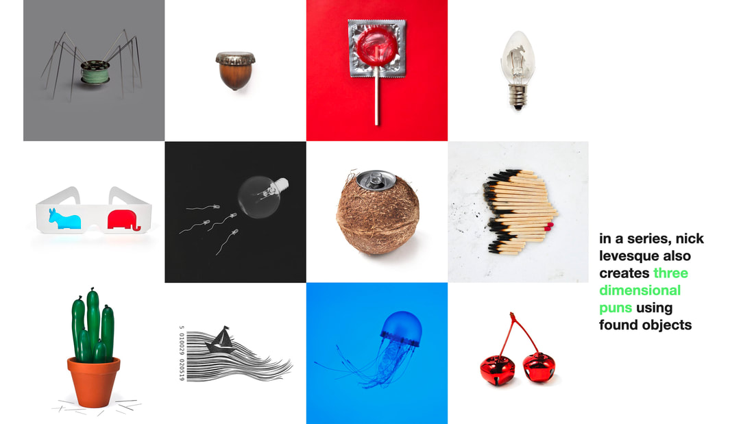
One of my favorite illustrators, Christoph Niemann, uses found objects to create clever illustrations. In a series, Nick Levesque also creates three dimensional puns using found objects.
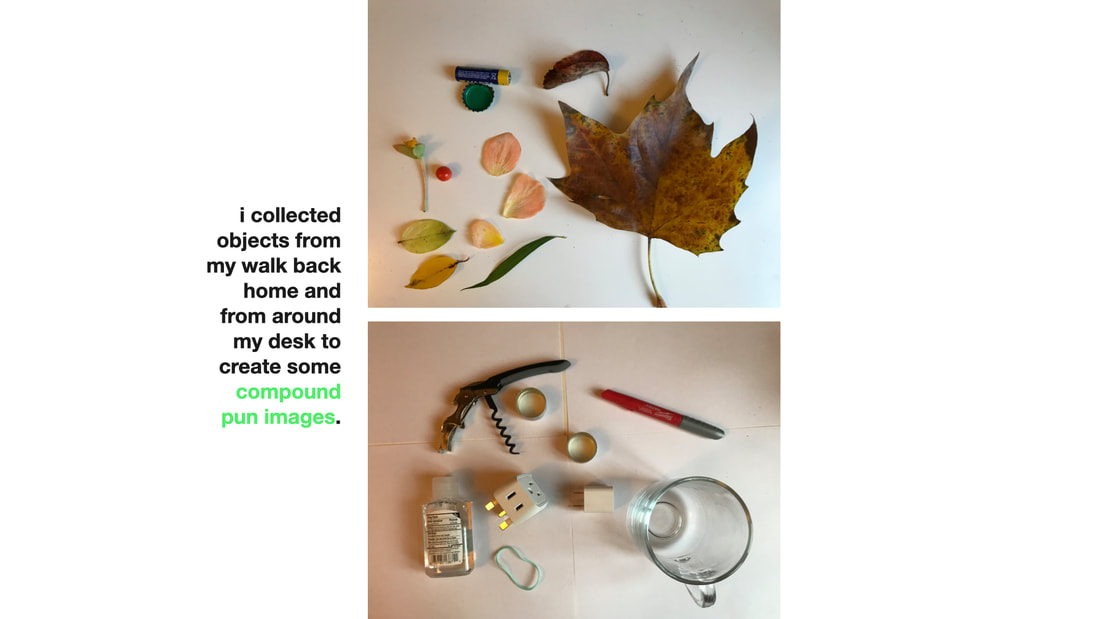
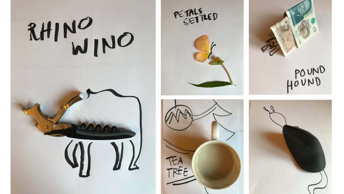
I collected objects from my walk back home and from around my desk to create some compound pun images.
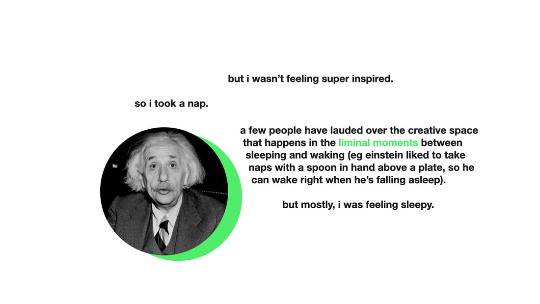
But I wasn't feeling very inspired. So I took a nap. There is creative space that happens in the liminal moments between sleeping and waking. For example, Einstein liked to take naps with a spoon in hand over a plate, so he could wake right when he's falling asleep. When I woke, the first thing I saw was my phone screen, and it lit in my head that I should do something with app icons.
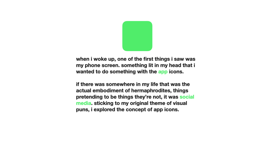
If there was an embodiment somewhere of hermaphrodites, things pretending to be what they're not, it was social media. Sticking to my theme of visual puns, I explored the concept of app icons.
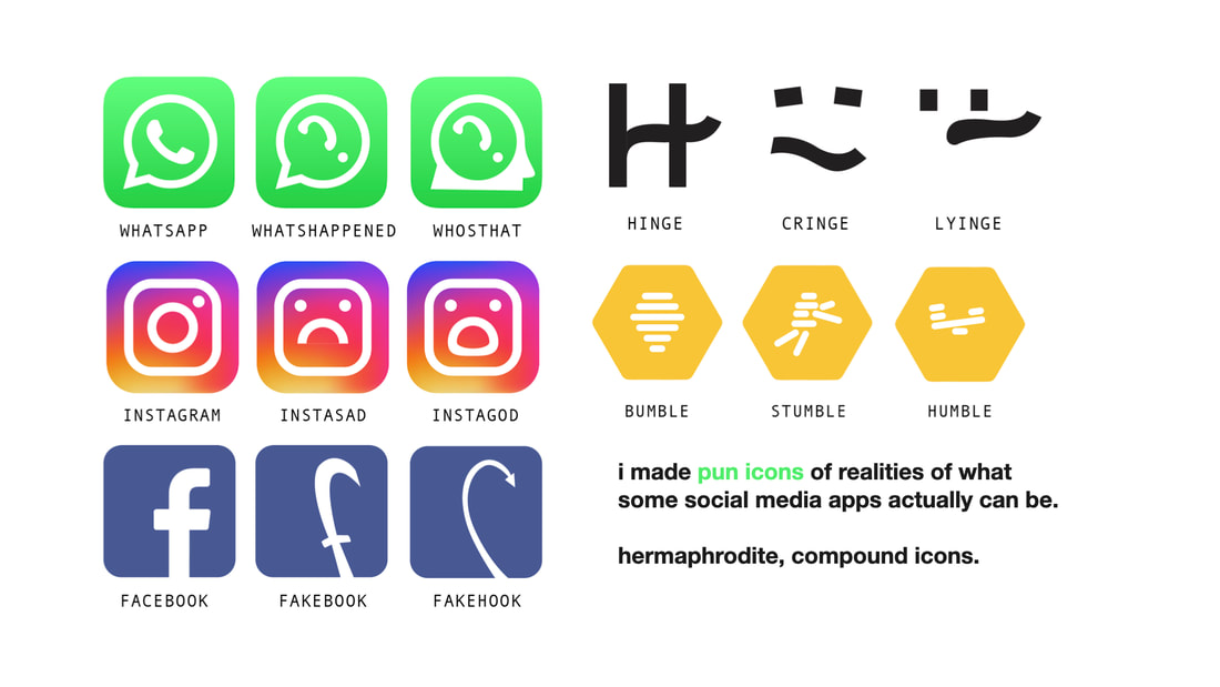
I made pun icons of what the realities of some apps could be.
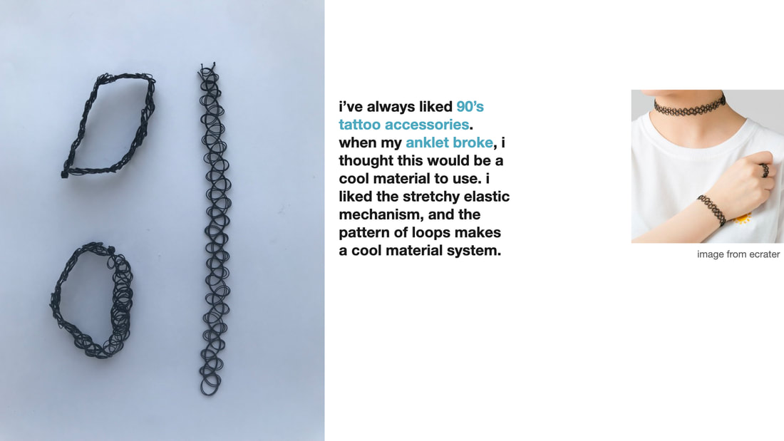
I love 90's tattoo accessories. When my anklet broke, I thought this would be a cool material to use. I liked the stretchy elastic mechanism, and the pattern of loops makes a cool material system.
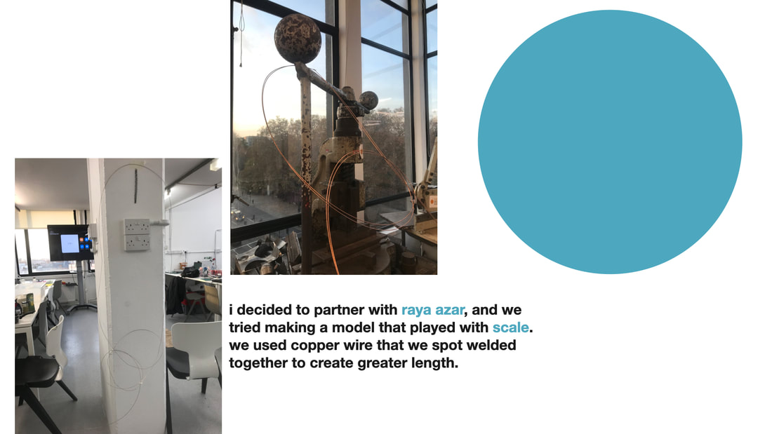
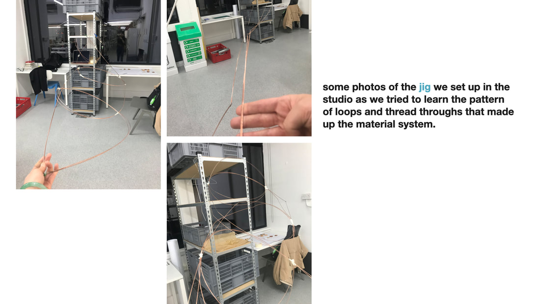
Partnering with a colleague, Raya Azar, we made a model that played with scale. We used copper wire that we spot welded together to create greater length. Here are some photos of the jig that we put up in the studio as we tried to learn the pattern of the system.
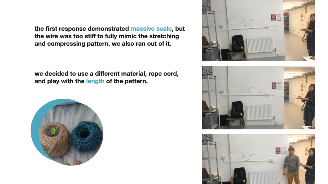
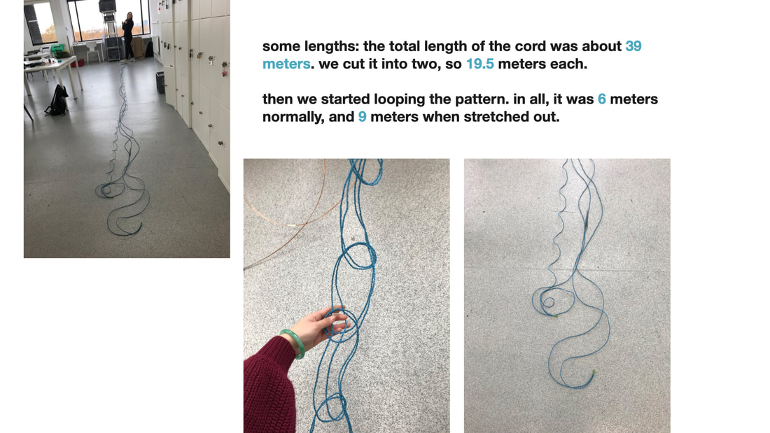
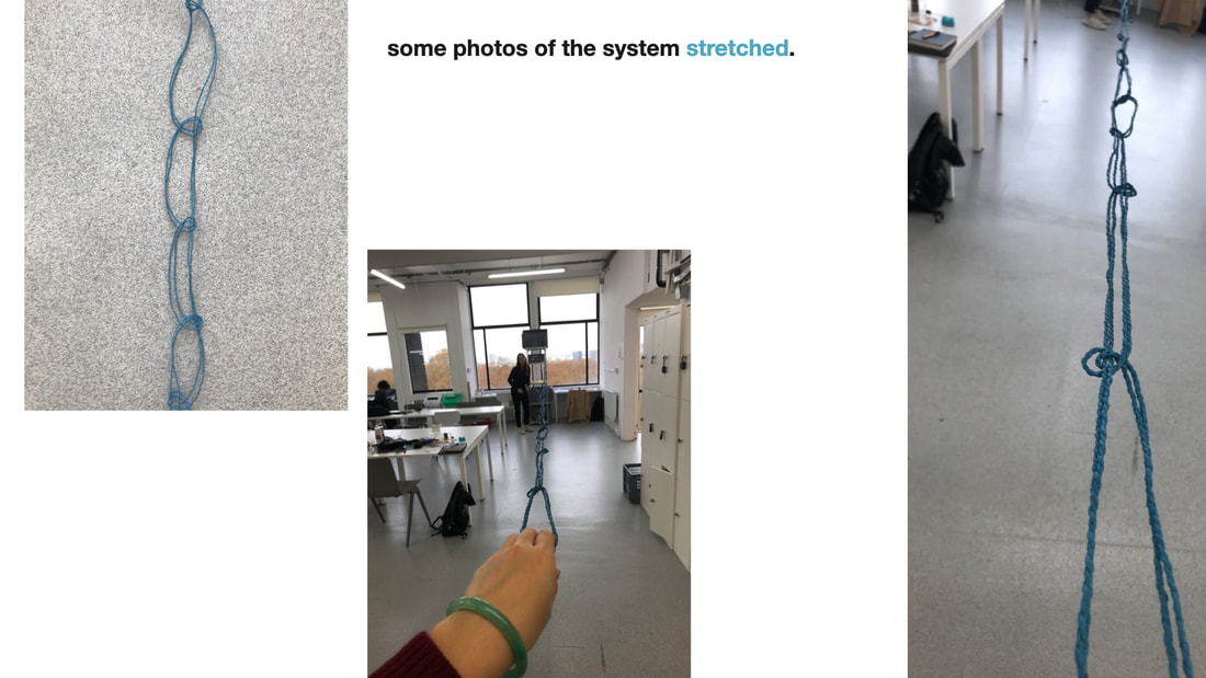
The first response demonstrated massive scale, but the wire was too stiff to mimic the stretching and compressing pattern. We decided to use a different material, rope cord, and play with length. The total length of the cord was 39 meters. Cut in two, that was 19.5 each. As we started looping the pattern, the overall creation was 6 meters at rest, and 9 meters stretched out.
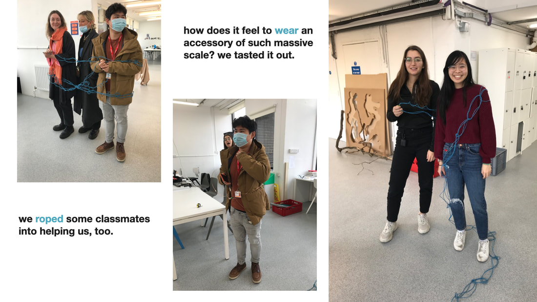
How does it feel to wear an accessory at such massive scale? We tested it out. We roped some colleagues into helping us, too.
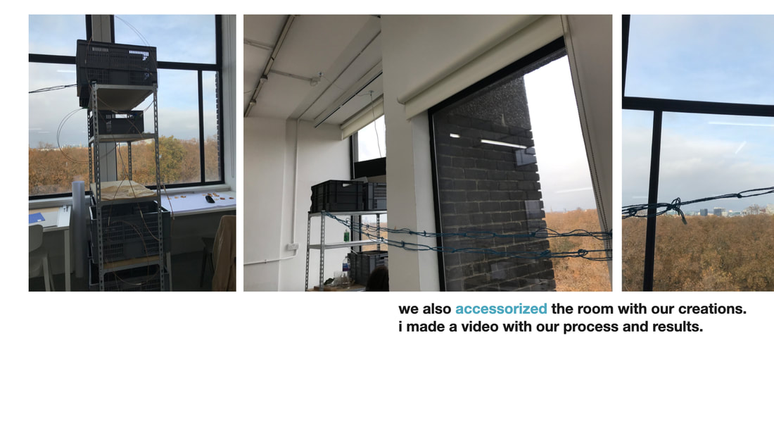
We also accessorized the room with our creations. I made a video with our process and results.
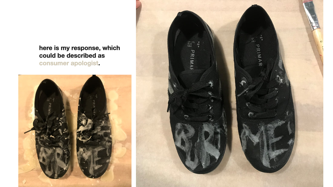
Here is my response to the prompt 'resistance/evil,' which could be described as consumer apologist.
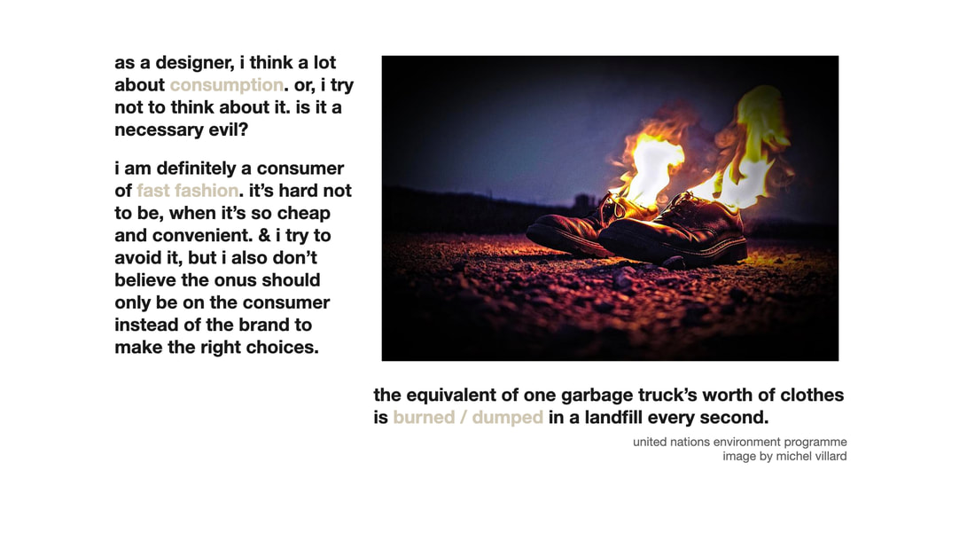
As a designer, I think a lot about consumption. Is it a necessary evil? Should I be contributing to consumer culture? I definitely consume fast fashion: it's hard not to when it's so cheap and convenient. Should it be on the onus of the consumer and not the brands to make the right choices?
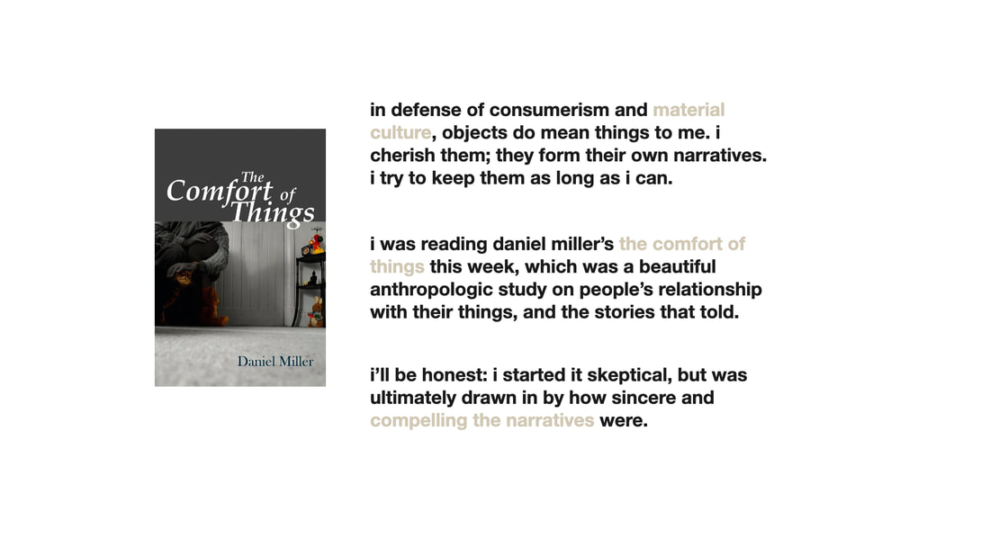
In defense of consumerism and material culture, objects do mean something to me. I cherish them; they form their own narratives. I try to keep them as long as I can. Daniel Miller's The Comfort of Things is a beautiful anthropologic study on people's relationships with their things. I started out skeptical, but was drawn in by how compelling and sincere the narratives were.
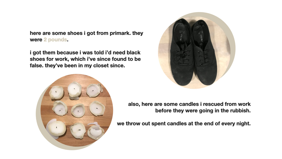
Here are some black shoes I bought from Primark for 2 pounds because I was told I needed them for work, which turned out to be untrue. And here are some candles I salvaged from the restaurant I worked at: we throw out spent candles at the end of every night.
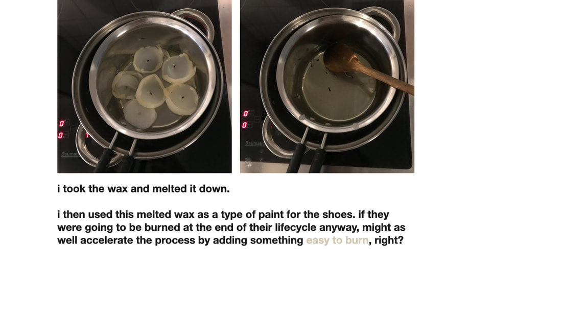
I melted the candles down to wax and used this as paint for the shoes. If they were going to be burned at the end of their lifecycle anyway, might as well accelerate the process by adding something easy to burn, right?
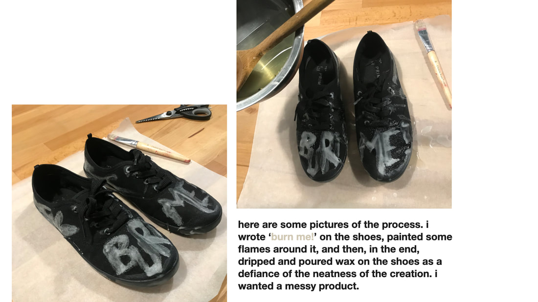
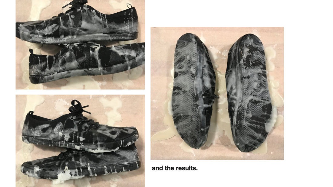
I wrote 'burn me' on the shoes with wax, and then dripped wax all over them in defiance of the neatness of the creation. I wanted a messy product.
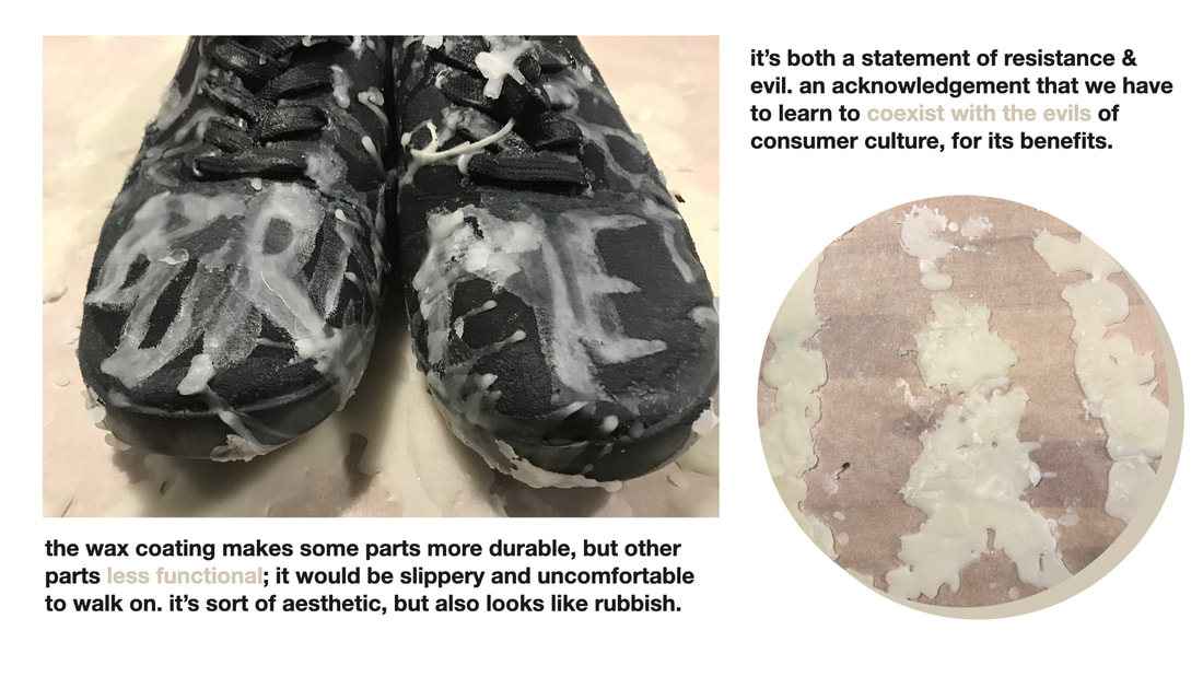
It's a statement of both resistance and evil. Acknowledgement that we have to learn to coexist with the evils consumer culture, for its benefits. The wax coating makes some parts more durable, but others less functional. It would be slippery and uncomfortable to walk in. It's sort of aesthetic, but also looks like rubbish. And isn't that what fast fashion is?