fill usage study
human use analysis on water bottle filling stations around MIT campus
methods: survey, observation, product scan, market research
tags: water bottles, website development
outputs: website, set of recommendations for product improvement
tags: water bottles, website development
outputs: website, set of recommendations for product improvement
brief + background |
Fill was a case study in research, user experience, and web development. I conducted observational and situational user research and then designed a website to report those findings. I studied the different water fountains around campus, polled users, and watched interactions with the fountains. Then, I created a website synthesizing the results and suggesting improvements. The website showcases a human-use analysis on the water filling stations around the MIT campus. I wanted to go for a simple, cohesive website design that also allowed for some user interaction. The website can be found here.
I wanted to conduct human use analysis on the campus water filling stations located around MIT. These are the stations around campus that are used to fill up water bottles, and are typically located near water fountains. The main purpose of these stations is to provide users with a quick and easy way to fill up their reusable water bottles. They are much more efficient than trying to juggle filling up a water bottle from a typical drinking fountain, and include a filtering system so are theoretically better than just refilling a water bottle from the tap. In addition, they provide users with a feel-good justification after use, because all of them include a display screen that increments after every use and shows the number of plastic water bottles whose waste had been eliminated. Americans use 50 billion disposable water bottles a year, and the U.S.'s recycling rate for plastic is only 23% (source). With going green a global trend, this makes users feel good that they are contributing to helping save the planet. Located all around campus, frequently near a bathroom, the stations serve most of the MIT population. Owning a reusable water bottle is almost part of MIT culture. More likely than not, even if a student comes in without owning a reusable water bottle, they will walk out of the first career fair owning at least three for free. The filling stations around campus are all from the brand Halsey Taylor, though not all of them are of the same model. A quick walk around campus shows the inconsistencies of the types of stations that exist. Here are some photos of the assorted water stations and water fountains around campus: |
user experience analysis |
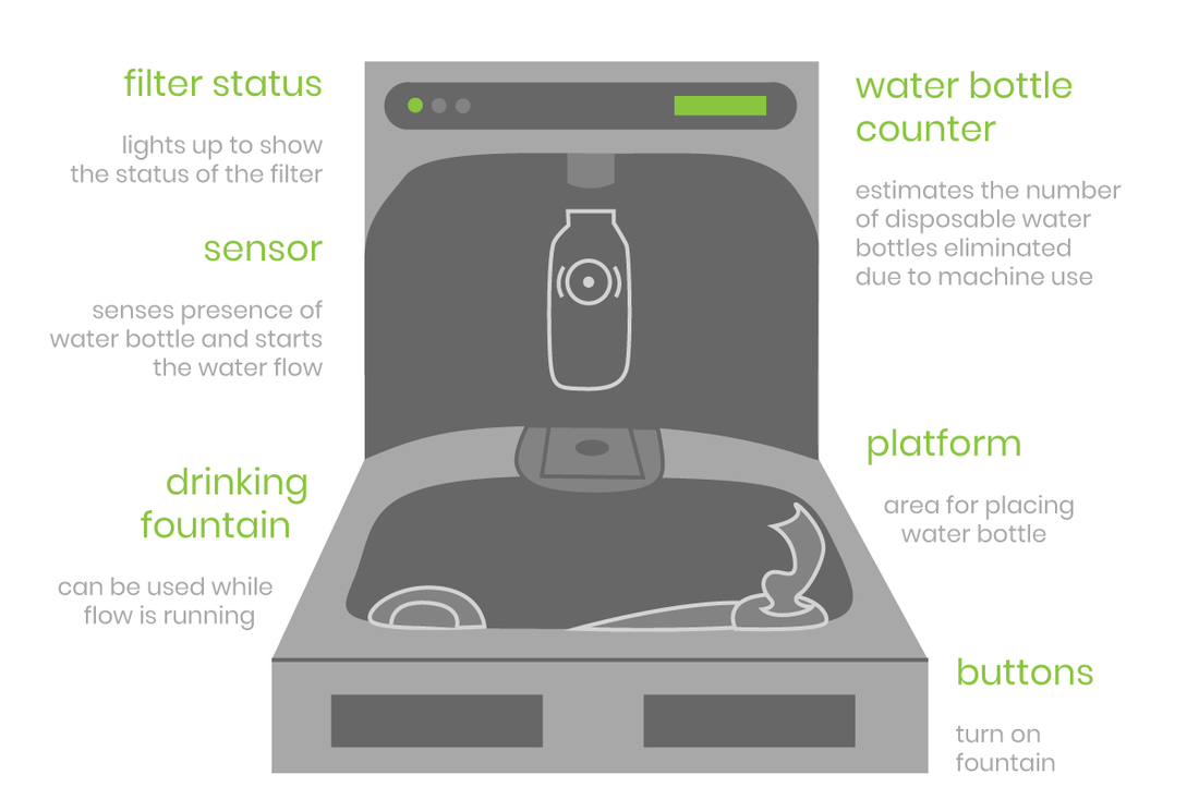
A typical unit consists of a platform underneath a water dispenser that could fill up a water bottle, with a water fountain in the front. Some variations include types with an additional water fountain on the side, types with manual buttons, and types with automatic sensors.
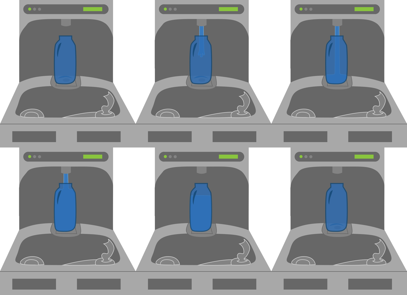
There are two types of stations: automatic and manual. In the automatic station, a user walks up with an open water bottle and places the water bottle on the platform. The station will sense the presence of a water bottle and will start filling up the bottle with water. The stream of water stops when the user takes away the water bottle. Filling up the water bottle usually takes a couple of seconds, during which the user's hands are free to do other things, such as quickly check email or tie their shoelace. It is important to note that water flow will not automatically stop when the bottle is full but will continue to overflow until the user takes away the bottle. In the manual station, a user walks up with an open water bottle and places the water bottle on the platform. The user then presses a button to fill up the water bottle and has to continue to hold down the button as the stream of water fills up the bottle the desired amount. The stream of water will stop when the button is released. |
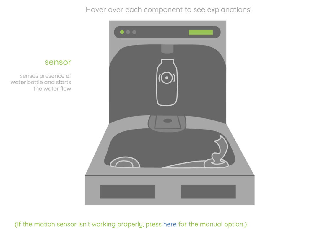
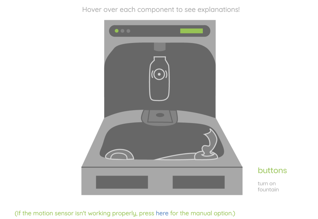
For the website, I diagrammed the 'typical' water filling station. The most fun part of it was this 'interactive' aspect where I coded it so the explanation for each part only appeared when users hovered over it, like a motion sensor. That page on the site can be found here and the full diagram is replicated below.
market research & product analysis |
In conducting the product analysis, I noticed that from the Halsey Taylor website, the price range for an average unit is $1,500-$2,500. Their main competitor, ELKAY, lists fairly similar prices and has almost the same type of interface. The main categories that each offer include "regular," "vandal-resistant," "green," "architectural contour," and "wall mount." The vandal-resistant models are said to be for higher-traffic areas, though from both websites there doesn't seem to be much difference between those and the regular ones other than price-point. Architectural contour and wall mounts simply define how the products interface into the wall. Green models advertise that they are even more energy-saving.
The ones that MIT has are the regular ones, in automatic and manual. Each type of station comes with its own set of problems. In the first, the user has to pay attention to the dispenser to know the current water level. Also, the stream of water does not stop right away when the bottle is removed, so the outside of the water bottle, and sometimes the user's hand, typically gets soaked in the process of removing the bottle. Luckily, these stations are usually positioned outside of bathrooms, so there is a convenient nearby location to find a paper towel to wipe off the excess water. In the case that the water dispenser will also automatically shut off, as in the fountain in building 5, it will typically not completely fill the bottle, leaving the user unsatisfied. Then, the user has to face the choice of leaving with an unfilled water bottle or attempting to start the process again, but this time with a wet bottle exterior because the bottle had to be removed halfway through the second fill cycle. As for the manual type, users are usually annoyed to find that they have to press down the button the entire time. It can be taxing on the hand as well. |
survey & user feedback
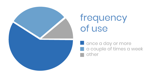
In a poll surveying 37 undergraduate students, 60% said that they used the water filling stations once a day or more. 30% said that they used it a couple of times a week. The remaining 10% were split between a couple of times a month and rarer, with two people saying that they've never used the stations. From the sample above, it would be an accurate statement to say that the majority of MIT undergraduates use the stations very frequently. Other users include graduate students, faculty, tourists, and other campus visitors. While I can assume that these users also use the stations with varying degrees of frequency, I can't extrapolate because my only survey respondents were undergraduates.
What they like:
What they like:
- "They're fast and easy to use. Water tastes better than tap water and is cold."
- "Don't have to buy plastic bottles, easy to refill my personal bottle."
- "Seeing the number go up on the number of bottles you saved counter is super satisfying."
- "They're located in convenient places, and they're designed for water bottles. Normal water fountains are made for drinking straight of them, so you'd have to tilt your bottle and fill about half before water spills out. With the campus water dispensers, I can fill the whole bottle."
- "The distribution is quite uniform. I can find one easily."
- "Sometimes the motion detector won't work. Also if I'm filling up a smaller water bottle, I'll waste water while it stops."
- "They are sometimes nonfunctional. They are not all the same - some you have to hold down a button, some there is a sensor, some with sensors only fill for a certain period of time while some fill until you remove your water bottle."
- "When it says the wrong number of water bottles it's filled (eg sometimes I fill my 750ml bottle and it says it's the equivalent of three bottles of water). I dislike that they are always behind the taller of the (usually two) fountains, because then people who just want a sip have to use the shorter fountain."
- "I can't tell when my water bottle is close to filled and the water often spills over. I try to remove it in a panic."
- "Sometimes the filters aren't completely clean, i.e. marked yellow or red. Plus, some dispensers are really slow to fill the bottle, whereas others are really fast."
recommendations
The bottom line: what most respondents seemed to look for, after aggregating all the answers, were ease, speed, convenience, consistency, and water taste.
In general, the water filling stations are pretty good as they are, and certainly are better than the old method of refilling water bottles from normal drinking fountains. Most users were satisfied with their experience. However, there could always be room for improvement. I have some suggestions that can make the overall process and experience more user-friendly.
Combining both the manual and automatic types seems to be the best solution that could get rid of many of the problems that users faced. One solution is to have the water filling station be automatic to start, activated by the sensor, but the user can press a button to stop it. Another solution is setting it so that pressing the button the first time turns the station on, and pressing it again turns the station off, like a simple switch. Both solutions keep the station hands-free while eliminating the problem of overfilling the water bottle and inconveniencing the user upon removal. Reducing the need for a motion sensor, like in the second proposed solution, could also cut down cost.
In addition, it would be ideal to have a consistent type of water filling station all throughout campus so users would immediately know what to do instead of having to waste time figuring out what type of station it is. I'd keep the interface for this station as simple as possible. I tested the water stations and for most of the stations it is possible to drink at the same time that a water bottle is being filled, but as seen from user responses a lot of users feel awkward about that. Thus, at least 50% of the current interface is always out of use, because users typically don't drink while someone else is filling a water bottle and vice versa. Because of this, I'd separate the water bottle filling station and the water fountain part of the interface and place them side by side, as is the case with typical drinking fountains.
Finally, the last major thing that users commented on was the ambiguity of the filter display. As it is, the display is only visible when users are standing in front of the station. Instead of putting the display in the top band, I would have a light on the side of the station to show whether or not a filter is in need of changing. This way, users will already know when approaching the station if the filter is out-of-date, and the service workers who replace the filters can more easily see which fountains are in need of changing filters. The current display has three states, green, yellow, and red, and it is unclear for users to know what exactly yellow means (and whether it is good to drink). I'd eliminate that intermediate state completely.
If I were to continue the project, I would implement design prototypes for my suggested improvements and also devise a set of success metrics in order to test how my improvements function with the baseline. Then I would be able to provide a more detailed set of recommendations or use the information to design an improved water filling station.

